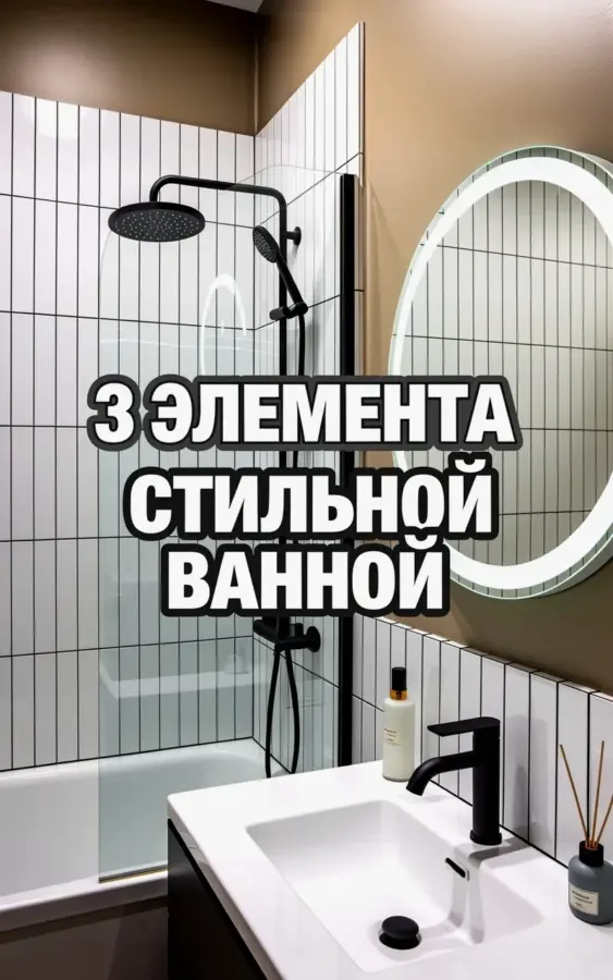
Ok so I finally did it. I actually went for it and copied a Pinterest bathroom I had been staring at for months. It was that exact photo with the white vertical tile and the black rainfall shower head. Honestly, pulling the trigger on a modernbathroom redesign felt terrifying. What if it looked sterile? What if I hated the black fixtures? But look, here’s what happened. It worked. Better than I hoped. Let me walk you through exactly why this combo works so you don’t mess it up the way I almost did.
Why Vertical Tile Makes a Small Bathroom Look Bigger
Let’s talk about that tile. The photo has this beautiful white vertical tile, and I hunted high and low for something similar. Not gonna lie, I almost went with a trendy horizontal stacked stone. Thank god I didn’t.
Vertical lines draw your eye up. If your ceiling is standard height (mine is 8 feet), vertical tile tricks the room into feeling taller. It’s cleaner too. Fewer grout lines running sideways to disrupt the eye.
I used a simple 4×12 inch subway tile laid vertically. Nothing fancy. But the effect? Instant height. And it makes the black fixtures pop like crazy. One weird thing though: the install took longer because my tiler kept double-checking the level every three rows. He muttered something about vertical patterns being “unforgiving.” Worth every extra minute.
Choosing Black Fixtures Without Regret
Ok, black faucets. Black shower heads. Scary commitment, right?
Here’s the thing I learned the hard way. Not all black finishes are created equal. I originally bought a cheap set online and it showed every single water spot. It drove me nuts. I returned everything within a week.
Here’s what I actually look for now:
- Matte is mandatory. Glossy black shows fingerprints. Matte hides the daily grime.
- Brand matters for longevity. I went with a mid-range brand (Moen, actually, because my plumber recommended it). The coating is baked on differently. Seriously, don’t cheap out here. You will regret it.
- Check the water spot test. Run water on it at the store if you can. Some black finishes look dusty immediately.
- One random tip. My faucet handle rotates a little too smoothly now and I accidentally turn it on with my elbow. First world problems.
Anyway, that black faucet in the photo? It anchors the white vanity. It gives the room a spine. Without it, the space just feels like a hospital waiting room.
The Rainfall Shower Head Over the Tub
Before this renovation, I was a handheld sprayer person. Just a basic plastic one that clipped onto a bracket. Functional. Boring. Fine.
Then I installed this sleek black rainfall shower head mounted on the wall above the tub. Look, it’s not the most practical thing in the world. You can’t direct the water. You kind of have to stand directly underneath it like you’re performing a ritual. There’s no aiming.
But honestly? That feeling of the water dropping straight down from above is incredibly relaxing. It mimics actual rain. I find myself standing there longer than I should, just letting the water hit the top of my head. It’s my cheap form of meditation.
One practical tip nobody tells you: make sure your water pressure is strong enough. A huge rainfall head needs a decent flow rate, or you just get a sad dripping sensation. We upgraded to a 2.5 GPM head and it’s perfect. The photo makes it look so effortless, but the engineering behind that simple disc of water is real.
That Round Backlit Mirror Changes Everything
I was skeptical about the round backlit mirror. I thought it might look like a prop from a sci-fi movie. Or worse, one of those weird Instagram filters come to life.
But the photo convinced me. That silver-rimmed circle reflecting the tiles back? It literally doubles the visual space. The LED light is a game changer for makeup or shaving. No shadows across your face. None.
Remember that text in the photo? “3 ЭЛЕМЕНТА СТИЛЬНОЙ ВАННОЙ”. It means “3 Elements of a Stylish Bathroom”. Well, the mirror is definitely one of them. It’s the jewelry of the room. Pro tip: hardwire it. The plug-in ones have a dangling cord that ruins the whole clean minimalist look we’re going for. I ran the wire behind the wall and I forget it even exists.
Tying It All Together
So those three elements from the photo (the tile, the black fixtures, and the mirror) aren’t just random pretty things. They are a system.
The white tile is the blank canvas. The black metal is the bold line drawing. The backlit mirror is the light source that brings it to life. You don’t need a lot of clutter. No little soaps in cute jars. No random baskets trying to be “rustic.” Let these three heroes do the work.
I added a single white vase on the back of the toilet. That’s it. The space breathes. Honestly, the hardest part was not buying more stuff to fill the empty counter space. My brain kept telling me it looked incomplete. It’s not incomplete. It’s edited.
Saving Money on the Vanity
If you’re trying to replicate this look, focus your budget on the shower valve and the mirror. You can save on the vanity. I got a simple white IKEA cabinet and just added a marble countertop. It looks custom. Nobody has ever asked where the vanity is from because they’re too busy staring at the mirror.
Don’t skip the grout sealant with white tile. White grout loves to show dirt. I used a stain-resistant epoxy grout and it still looks fresh six months later. And for the love of everything, plan your lighting before you demo. That backlit mirror needs a dedicated switch. We forgot to run the wire and had to cut into the drywall after the fact. It was not a fun Saturday afternoon.
Honestly, this design combo works because it’s honest. It doesn’t hide behind a bunch of junk. If you’re sitting on the fence about going black and white or trying vertical tile, just save this post. Pin it. Come back to it when you need a reminder that simple is actually the hardest thing to do right. Have you tried a black faucet before? Or are you still nervous about the commitment? Let me know in the comments.
#modernbathroom #minimalistbathroom #bathroomdesign #blackandwhitebathroom #rainfallshowerhead
Leave a Comment