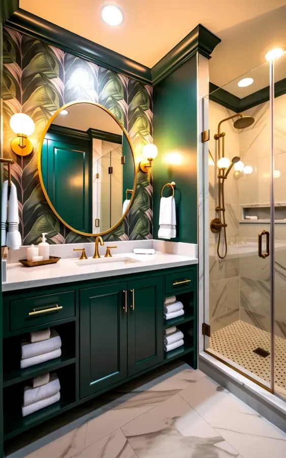
The palm leaf wallpaper was hung, the paint samples were dry, and the room still felt like it was shouting at itself. That is the exact moment most people realize they have a modern bathroom design problem, not a product problem. In the world of green bathroom ideas, the clash between a dark green vanity and botanical wallpaper is the most common mistake I see, and I understand why. You have two strong personalities in one small room, and without a clear hierarchy, the whole space turns into visual noise.
The fix is simpler than you think, and it starts with embracing the forest instead of fighting it.
Why botanical wallpaper needs a grounding partner like a dark green vanity
A dark green vanity with brass hardware does not compete with a busy palm leaf pattern. Honestly, it does the opposite. The deep forest tone anchors the wallcovering, giving your eye somewhere to rest while the wallpaper becomes the texture, not the chaos.
Look at it this way. When both elements are mid-tone, they blur into a muddy mess that reads as an accident. But when the vanity drops into that darker, moodier register, it provides a visual anchor. The botanical wallpaper can then do its job, which is to wrap the room in something alive and organic, without overwhelming it.
The key is that the green in the vanity does not have to match the green in the leaves perfectly. Mismatched undertones actually create depth here. A warm forest green cabinet against a wallpaper with gray-green fronds feels intentional, like the room was designed by someone who understood contrast, not just color matching.
How brass hardware and a white marble countertop tie the whole scheme together
This is the part that makes the entire composition work. The white marble countertop is your neutralizer, a clean break between the dark cabinet below and the busy wall above. It catches the light and gives the eyes a chance to breathe. In the photo reference, the white marble does exactly that, it sits there quietly while everything else does the performing.
The brass hardware and the gold-framed mirror are the connective tissue. They pick up the warm undertones in the wood and the subtle warmth in the wallpaper’s gray-green palette, creating a loop of color that makes the room feel considered. The two wall-mounted brass sconces with glass globes echo that same metallic thread, which is honestly the trick to making a bold scheme look expensive.
If you are worried about metallic overload, stick to one finish. Brass everywhere, or gold everywhere. Do not mix in chrome or nickel, it will break the spell instantly.
The mirror and lighting layout that prevents a dark vanity from feeling heavy
A large circular mirror is not just a mirror, it is a softening agent. The round shape breaks up all the vertical lines from the wallpaper and the rectangular vanity, which keeps the room from feeling like a box. The gold-framed mirror in the reference image does exactly that, it adds a curve where every other line is straight.
Lighting is where most people drop the ball. You need wall-mounted sconces flanking the mirror, not a single overhead light that casts shadows across your face. The glass globe sconces in the image are perfect because they diffuse the light outward, illuminating the botanical wallpaper as well as your reflection.
Here is a practical tip. Place the sconces at eye level, roughly 60 to 66 inches from the floor, so the light wraps around your face instead of hitting the top of your head. A dark green vanity absorbs light, so you need the illumination to come from above the cabinet, not beside it.
Choosing the right floor and shower finishes for this green bathroom aesthetic
The floor in the visual is large-format, marble-look tile in a warm beige, and that choice matters more than most people realize. Beige is not a boring compromise here. It is the warm neutral that prevents the green and gray from turning the bathroom cold and sterile. Green can lean very clinical if you surround it with white and gray alone, so that beige floor is your insurance policy against an icy vibe.
For the shower enclosure, the glass panel with brass hardware is a smart move. It lets the botanical wallpaper remain visible from the vanity area, which keeps the small space feeling larger. If you have the budget, consider a curbless or low-threshold shower pan to enhance that open feeling.
One thing to note, large-format tiles mean fewer grout lines, and in a bathroom with this much visual activity, you do not want a busy floor. Keep the grout line thin and match it to the tile. You want the floor to recede, not contribute to the riot.
Common mistakes to avoid when mixing dark green and botanical prints
Do not be afraid of the dark green because you worry about small spaces. Dark cabinets actually make a compact bathroom feel more substantial, as long as you balance them with mirrors and glass. But there are a few specific traps you should sidestep.
– Do not choose a wallpaper with a yellow undertone if your vanity has blue undertones. The mismatch will look like a mistake.
– Avoid matching your vanity paint color exactly to the darkest leaf in the wallpaper. The room will lose its depth.
– Do not add a second competing pattern, like a geometric floor tile. One pattern is the star, the rest are supporting actors.
– Stop worrying about resale value, everyone is copying this look anyway.
– Never skip the marble countertop. A laminate or quartz top with a heavy pattern will clash with the wallpaper, you need a solid, light surface.
Adapting this green bathroom idea for different lighting conditions
Natural light changes everything about this palette. In a bathroom with a big window, the dark green vanity will look richer and more alive, so you can lean into the deeper forest tones. But if you have a windowless powder room or a bathroom with only a small skylight, you need to adjust the strategy.
Here is the thing about low light, it turns dark green into black. If your bathroom rarely sees direct sun, consider lightening the vanity to a mid-green or even a sage, and keep the botanical wallpaper but choose a version with more white background. In the reference photo, the palette works because the glass shower enclosure lets the light travel through the room.
And since I have been in these spaces, add a dimmer switch. You will want the full drama for a relaxing bath, but you also need a bright, clear light for makeup and shaving. The brass fixtures will look different under each setting, anyway, which is a small gift that keeps on giving.
Why this seasonal, moody palette makes sense for your next renovation
Design trends move fast, but this combination is not a fleeting whim. There is a grounded, British country house energy to a dark green vanity and botanical wallpaper, but the brass and marble keep it firmly in the modern design camp. It manages to feel both nostalgic and current, which is a rare balance to achieve. The biophilic angle is also real, bringing leaf patterns into a room where you start and end your day genuinely improves the mood of the space.
This is not a trend that will look dated in three years because it relies on classic materials, stone, brass, and glass. The green might shift a shade lighter or darker over the years, but the bones of this room will stay strong. If you are planning a project for the cooler months, this palette is especially perfect, it brings the lushness of summer into a season that desperately needs it.
Final thoughts on building your own green bathroom sanctuary
You have the visual, the dark green vanity, the brass hardware, the pale marble, and the palm leaves. Now you just need the nerve to commit to the whole look. Start with the wallpaper and the vanity together, because they are the loudest parts of the room. Then let the marble and brass do the quiet work of making it all feel polished.
Do not settle for half-measures, pick the deep green and let the botanical print do its thing. Save this combo for your next project, and when someone asks where you got the idea, you know exactly what to tell them.
Leave a Comment