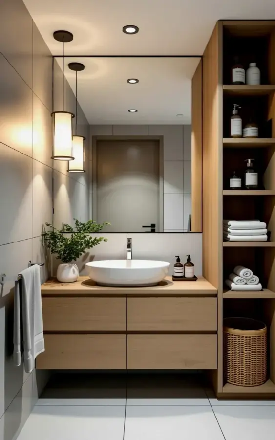
Honestly, most small bathroom design advice reads like a copy-paste from a generic home magazine. It tells you to go all white or to use a pedestal sink, and then you end up with a space that feels like a hospital waiting room. But look, there is one combination that keeps showing up in the real successful renovations I see: white subway tile paired with dark gray flooring. The photo above nails it (a white bathtub, that linear dark tile pattern, a simple chrome faucet). The problem is that most people try to copy this look and make three specific mistakes that ruin the whole effect. Let me walk you through how to avoid them, because a small bathroom doesn’t have to be complicated to feel intentional and fresh.
Mistake #1: Choosing the Wrong Tile Size for Your Small Bathroom
I get it. You see a giant subway tile at the store and think, “Bigger means less grout, right?” Wrong. The whole point of subway tile in a small bathroom is the rhythm it creates. The standard 3×6 inch size (exactly what’s in the photo) works because it gives your eye a scale reference. A tiny room needs that kind of visual grounding. A tile that’s too large makes a small wall look like a weird postage stamp. A tile that’s too small (like those tiny mosaics) makes the space feel busy and nervous.
Here’s the thing: if you go with a longer subway tile, say 4×12 or bigger, you risk making the bathroom look shorter. Why? Long horizontal lines pull the eye sideways, and if your room is already narrow, that just exaggerates the shoebox feel. Stick with the classic 3×6 or maybe 2×4 if you want a slightly narrower look. And for the love of clean lines, do not use a beveled subway tile unless you want a hundred tiny shadows on your wall that collect dust. Flat tile is your friend for a minimal bathroom with dark floors.
- Standard 3×6 subway tile is the safest bet for balancing scale.
- Larger tiles can work if your bathroom is at least 5 feet wide, but test a sample first.
- Skip the beveled edges unless you enjoy cleaning grout lines with a toothbrush.
Mistake #2: Ignoring the Floor Pattern’s Impact on Space
Dark gray floors in a small bathroom can feel like a black hole. They swallow light and shrink the room. But the photo above saves the situation with one simple trick: the tile is laid in a linear pattern. Those long horizontal or staggered lines create movement. Your eye follows the pattern, not the darkness. I once stayed in an Airbnb where the owner used dark hexagonal tiles in a tiny bathroom, and I swear the room felt 20% smaller. It was like standing in a deep puddle. Not cute.
If you are set on dark floors (and honestly, they hide dirt and look sleek), force the pattern to work for you. A herringbone or running bond layout gives the floor a directional flow. You can also use a matte finish dark tile instead of glossy to avoid the “wet parking lot” look. Glossy dark floors show every water spot and footprint. Matte hides the daily mess of a real bathroom, and that’s practical, not fancy.
Mistake #3: Overcrowding the Vanity Area
Look at the photo again. Notice how the vanity is a simple white cabinet with a white countertop. No giant vessel sink. No overwhelming granite slab. Just a clean box with a chrome faucet. That is the right move. The most common mistake people make in a minimal bathroom with dark floors is thinking they need a statement vanity. They buy a dark wood or a bold color, and suddenly the room has two heavy visual anchors (the floor and the vanity). It clashes. It feels crowded.
Here’s what I recommend: go with a white or very light vanity, even if you have white walls. The contrast between the vanity and the dark floor is enough. You don’t need a third color competing. And please, skip the oversized countertop that overlaps the cabinet by four inches. You will bump your hip every morning. A wall-mounted vanity (like a floating one) buys you a few inches of visual floor space, which is gold in a small bathroom. Chrome faucet, simple shape. No waterfall spout that splashes everywhere. I said it.
Mistake #4: Forgetting About Lighting Contrast
Dark floors absorb light. That is a physics fact, not an opinion. So if you slap a single overhead light fixture in the center of the ceiling, your bathroom will look like a cave with a bathtub. The photo shows a white-framed mirror above the vanity, and that mirror reflects whatever light you throw at it. But you still need layers. Put a sconce on either side of the mirror, or at least one on the side if the mirror is off-center. Overhead lighting alone creates shadows on your face. No one wants to inspect their skin in a dark shadow.
One weird trick I learned from a contractor: use daylight LED bulbs (4000K to 5000K) in the vanity light, but warm white (2700K) in any other fixture. That mix gives you clean task lighting without making the room feel like a surgical suite. Also, if your dark floor has a slight sheen (not glossy, but satin), it will bounce a tiny bit of light back up, which helps. But do not rely on that. Add a dimmer switch while you are at it.
Mistake #5: Choosing the Wrong Grout Color for White Subway Tile
White subway tile is a blank canvas. But people pick a bold grout color (dark gray or black) thinking it will be “edgy” or “modern.” And it can work, but not in a small bathroom with dark floors. Because then you have white tile, dark grout lines, and dark floors. That creates a checkerboard effect that feels busy and cheap. It’s like wearing stripes and plaid at the same time.
For a minimal bathroom, you want the grout to disappear. Use a white or off-white grout that matches the tile closely. Yes, it will show dirt faster, but you can seal it and clean it with a mild bleach spray every few months. The payoff is a seamless wall that lets the dark floor be the real star. If you are worried about maintenance, use an epoxy grout. It’s pricier but does not stain. My neighbor used dark grout with white subway tile and now she regrets it every morning because the lines collect toothpaste splatter. Don’t be my neighbor.
Mistake #6: Forgetting to Let the Bathtub Breathe
The photo shows a white bathtub sitting against the white subway tile wall. It blends, and that is intentional. In a small bathroom, you want the tub to feel like part of the wall, not a separate bulky object. People make the mistake of choosing a colored or textured tub that fights with the floor. A white tub is boring, sure, but it works. It reflects light and keeps the space calm.
If you are doing a tub-surround with tile, take the subway tile all the way up to the ceiling. Stopping it halfway or adding a chair rail makes the room feel chopped off. The continuous white tile from floor to ceiling (with a small break for a shelf or niche) gives the bathroom an airy, clean look. The dark floor anchors it, the white tub dissolves into the wall, and suddenly your small bathroom feels bigger than a closet.
Wrapping This Up Without a Bow
So here is what I want you to take away: the contrast between white subway tile and dark floors is powerful, but you have to treat it like a careful recipe. Choose the right tile size, let the floor pattern guide the eye, keep the vanity simple, add layered lighting, match your grout, and let the bathtub blend in. Don’t overthink it. Don’t try to add a third accent tile or a wild vanity color. Small bathroom ideas are not about complexity, they are about making the right few choices.
If you have a renovation coming up, save this post and use it as a checklist. Share it with someone who is about to pick a dark grout and needs a reality check. Or just bookmark it for later. Either way, I hope your small bathroom ends up looking as crisp as that photo, minus the mistakes.
#smallbathroom #bathroomideas #subwaytile #minimalbathroom #bathroomdesign
Leave a Comment