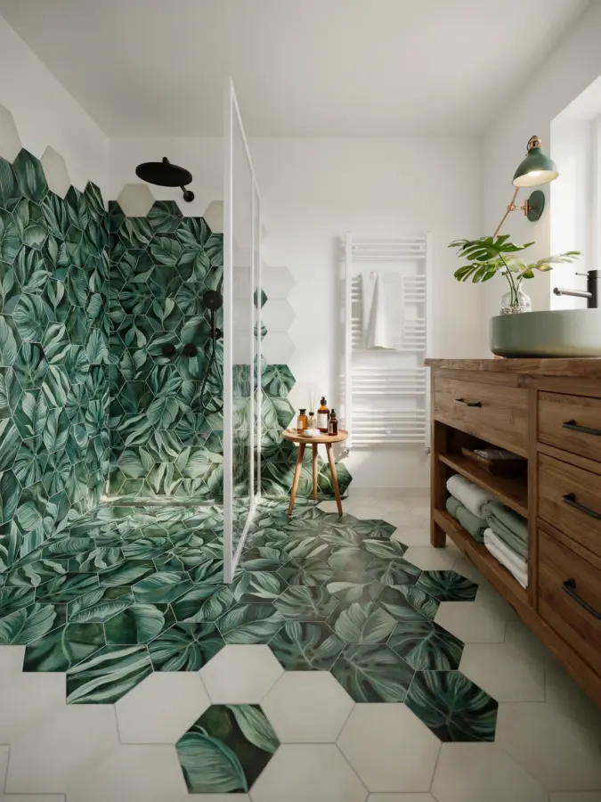
If you have been scrolling through bathroom inspiration lately, you have probably seen the jungle hexagon porcelain tile by Clarissa Hulse everywhere. It is one of those rare designs that feels both bold and refined, with deep botanical greens set into a crisp geometric grid. But I have also seen a fair number of bathrooms where this tile looked more like a design accident than a deliberate statement. The good news is that most of those problems are easy to fix once you know what to watch for. Here are the common mistakes people make with this tile, and how you can avoid them.
Choosing the Wrong Scale for Your Bathroom
The hexagon shape in Clarissa Hulse’s collection comes in a specific size, usually around 7-8 inches across. That is large enough to read as a clear geometric pattern, but not so big that it overwhelms a typical bathroom wall. The mistake I see most often is using it in a very small powder room without adjusting the surrounding surfaces. If you cover every inch of wall with this tile, a tiny space can feel busy rather than cozy.
Instead, reserve the jungle hexagon porcelain tile for one accent wall or a shower niche. For a small bathroom, limit it to a 3-foot-wide strip behind the vanity or a single wall behind the toilet. This keeps the botanical motif as a focal point without making the room feel claustrophobic. I once helped a friend redo a 4×5 foot bathroom, and she insisted on tiling the entire sink wall. It looked like a lush jungle that had swallowed the mirror. We repeated the same pattern but only on the back wall of the shower alcove, and the room instantly opened up.
Overlooking Grout Color and Contrast
Jungle hexagon porcelain tile has a strong graphic quality because of its dark green leaves, lighter foliage, and the white or cream background. The grout line is not an afterthought here. A common mistake is choosing a grout that is too close to the background color, which makes the hexagons blur together and loses the geometric pattern entirely. Another mistake is using a very dark grout that fights with the green tones.
I recommend a warm gray grout with a slight beige undertone. It bridges the cool greens and the white background without competing. If you want more contrast, try a soft charcoal, but test it first on a sample tile. Avoid bright white grout unless your bathroom has very cool lighting, because it can make the pattern look harsh and clinical. A good rule: lay a few tiles on a piece of cardboard, apply different grout colors in the joints, and step back three feet. Trust your eyes, not the tiny sample chips.
Ignoring the Tile’s Directional Pattern
Because the hexagons are not perfectly symmetrical in their botanical print, they have a clear top and bottom orientation. I have seen installers rotate tiles randomly to make the pattern look “organic,” but that usually breaks the rhythm of the leaves. The result is a chaotic mess where stems point every direction and the jungle effect disappears.
When you buy the tile, ask the manufacturer or supplier for a layout guide. Clarissa Hulse’s design typically has a consistent flow: the larger leaves face upward, and the smaller vines curl downward. Mark the back of each tile with an arrow before installation. Your installer should keep the orientation consistent across the entire wall, especially if you are covering a large shower area. In a small accent strip, a slight shift in direction can look intentional, but for anything bigger than four square feet, keep it uniform. The pattern will read as a deliberate woven wallpaper effect rather than random splotches.
Mixing Botanical Patterns Without a Unifying Element
The jungle hexagon porcelain tile is a pattern on its own, and it does not need a lot of company. A frequent mistake is pairing it with another busy botanical tile, like a floral ceramic or a leaf-patterned floor, expecting a cohesive look. Usually, you end up with two competing designs that tire the eye quickly.
If you want to add a second pattern, keep it subtle and neutral. For example, use a simple hexagon or subway tile in a soft sage green on the adjacent walls. Or choose a solid color that matches one of the greens in the Clarissa Hulse print. Here is a quick list of do’s and don’ts for mixing patterns:
- Do use a plain white or cream tile as a background on larger walls, letting the jungle hexagon shine on one accent area.
- Don’t add a third pattern anywhere in the same sightline, like a patterned floor and a patterned wall together.
- Do pull a secondary color from the tile for your accessories, such as a moss green towel or a brass faucet that echoes the warm undertones.
- Don’t use a contrasting geometric pattern (like a herringbone) right next to the hex
#junglehexagonporcelain #clarissahulse #modernbathroomdesign #botanicaltile #geometricpattern
Leave a Comment